It’s all in how you want to look at it.
The Center for Neighborhood Technology has a recent study that gives the traditional antagonists — suburbanites and city dwellers — something for either side when the subject is the environment.
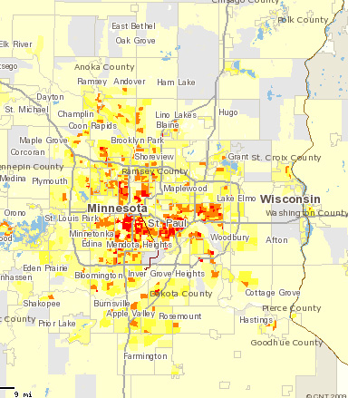
If you’re in the suburbs, you can point to the comparatively low amount of greenhouse gas emissions per acre (red is worst, light yellow is least):

Or if you’re in the city you can point to the comparatively low amount of greenhouse gas emissions per household:

You can play with the maps and compare regions here.
