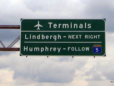
The Metropolitan Airports Commission’s decision to spend more than $2 million to upgrade airport signs providing directions to either the Humphrey or Lindbergh Terminal is low-hanging fruit for many people. “A waste of money” or “people should be responsible for figuring it out” are the most common complaints.
It actually makes a lot of sense because a real close look at the current signage reveals it doesn’t make much sense. (Push the play button below)
When I talked about this with Mary Lucia on The Current on Wednesday afternoon, Sara Bible of St. Louis Park was courageous enough to share her story:
I have to admit that when I first started taking the light rail to the airport, I once panicked when we arrived at the Humphrey terminal and so I got off and then had to run to get back on when I realized I really wanted the Lindbergh Terminal. Also, this past Memorial Day I had a friend arrive from Houston. He called to say he’d arrived but we couldn’t find him at the gate. He had flown in on US Airways and had no idea that there were two airports in Minnesota nor which one he was at. He checked his boarding pass and it wasn’t indicated. Even I don’t know which airlines are located at each terminal. And you can’t designate one the international terminal because flights fly internationally from both terminals. It is quite confusing and I’ve lived here for almost 4 decades.
Why do we have it “in” for airport travelers? And how many of the signage critics have never benefited from a highway sign telling us that the exit ahead is the one we want?
