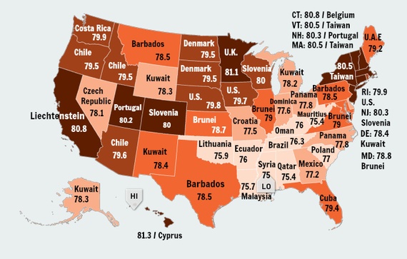
Especially considering last week’s MPR story showing “structural racism” as one reason for health disparities within Minnesota, this is a particular stunning map from Measure for America, the group that documents its “human development index.”
It’s a chart that shows the life expectancy by each state, with each state showing its “elsewhere in the world” equivalent. (h/t: The Atlantic)

As with most every other survey of states, the northeast, Minnesota, California, and a few mountain states lead the pack. Mississippi and the southeast bring up the rear.
Olga Khazan of the Atlantic broke it down:
There’s profound variation by state, from a low of 75 years in Mississippi to a high of 81.3 in Hawaii. Mostly, we resemble tiny, equatorial hamlets like Kuwait and Barbados. At our worst, we look more like Malaysia or Oman, and at our best, like the United Kingdom. No state approaches the life expectancies of most European countries or some Asian ones. Icelandic people can expect to live a long 83.3 years, and that’s nothing compared to the Japanese, who live well beyond 84.
Life expectancy can be causal, a factor of diet, environment, medical care, and education. But it can also be recursive: People who are chronically sick are less likely to become wealthy, and thus less likely to live in affluent areas and have access to the great doctors and Whole-Foods kale that would have helped them live longer.
