
A few months ago, Minneapolis turned the question of how many sailboats should be on the city’s logo into an actual debate. Change comes hard to the city’s graphics.
This might be a good time to take a look at this:
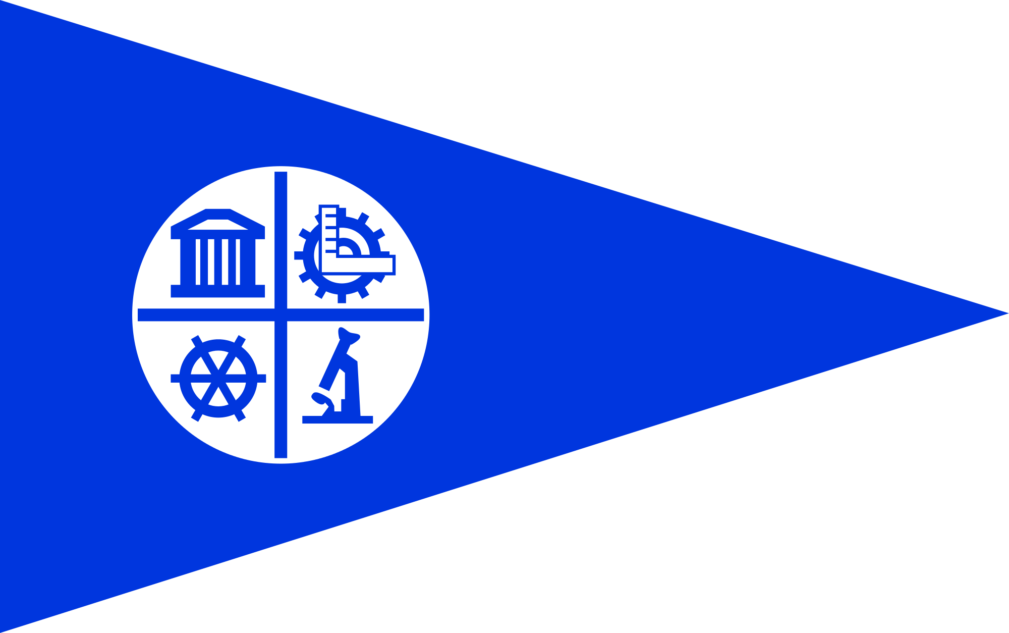
Ain’t she a looker? It’s the Minneapolis city flag. And it’s been declared among the ugliest city flags in the nation. Those are fightin’ words around here.
After Gizmodo listened to Roman Mars’ podcast and Ted Talk on flags…
… it set out to find the ugliest city flag. Guess who made the cut?
“Liberty, Engineering, Science….and boats!” said one of the online judges.
“A flag is a emblem of a place’s people, spirit, land, and history,” says the Citizens for a Minneapolis Flag Redesign Facebook page. “It is imbued with meaning and, when executed tastefully, creates a sense of pride and respect in the community. It is not only a symbol for its people, but a representation of the city to the rest of the world. There is so much more to say about Minneapolis than our current flag depicts.”
Not that much, maybe. The page has been fallow since January.
As these things go, Minneapolis is no St. Paul.
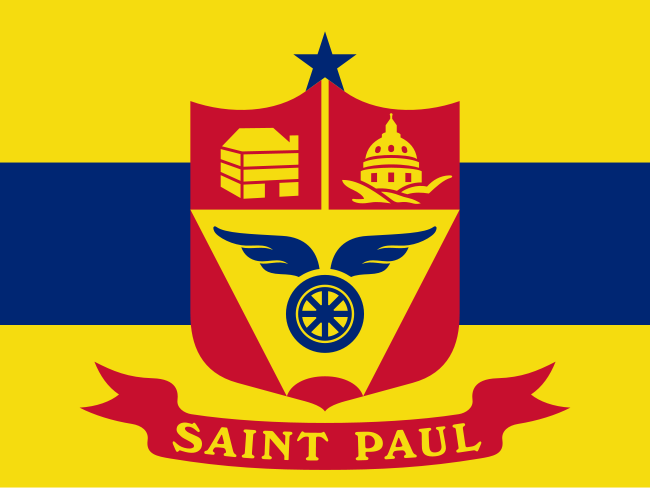
St. Paul’s flag, which makes references to… something, didn’t make the list.
But Minneapolis isn’t the only city with an ugly flag, according to Gizmodo.
Step forward, Rochester!
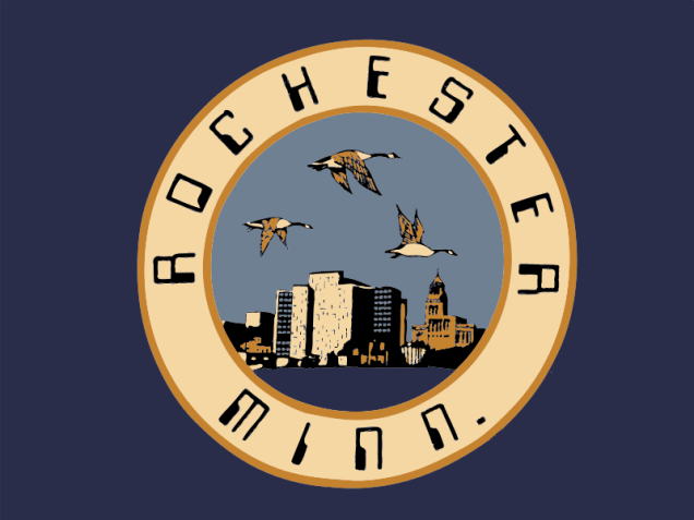
“Geese from the future,” Gizmodo said.
To our uneducated eye, the logo is pretty sweet. The font? Not so much.
In 1980, the city had a competition for a flag design and Laurie Muir, having just returned from her first year at Minneapolis College of Art and Design, thought it would be fun to enter. She won.
That font? It’s actually quite clever. It’s a reference to the city’s big employer at the time.
I designed the flag with a white circle on a royal blue background, as a historical reference to the Minnesota State Flag, which also has a blue background.
To represent Rochester’s main industry at the time, I included a city landscape in the background showing the main building of the Mayo Clinic, along with the Plummer Building, which is a National Historic Landmark.
I represented another major city employer, IBM, by using a computer-styled font for the lettering. In the foreground I placed a green/blue lake representing Rochester’s Silver Lake, which is an artificial lake in Rochester created by a dam and used to cool the electrical generating power plant.
Because the power plant produces enough heat to keep the lake from freezing in the winter, Canada geese stay in Rochester year round, and one often hears the geese honk as they fly overhead. This is represented on the flag by the three Canada geese flying over the city.
Times change, of course. IBM, which keeps secret how many employees still work in Rochester, has moved jobs to Mexico and the city’s future is in health care.
It might be time to update.
What makes for a good city flag? According to Gizmodo, it’s Provo’s.
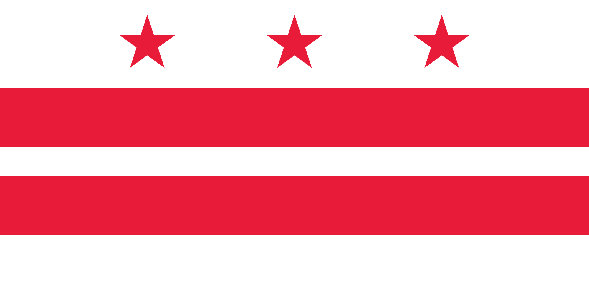
But vexillologists suggest Washington, D.C., has the best flag, followed by Chicago.
Both are quite alike.
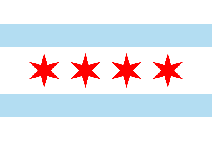
“In the United States, I’d have to rate Chicago far and away #1 in the use of official civic symbols (maybe the best in the world for all I know), and also note the overall high level of design quality of these objects … If you come to Chicago, you’ll notice that the city flag is ubiquitous,” the Urbanophile blog says.
People in Chicago love their city’s flag.
Your move, Minneapolis.
(h/t: Derek Schille)