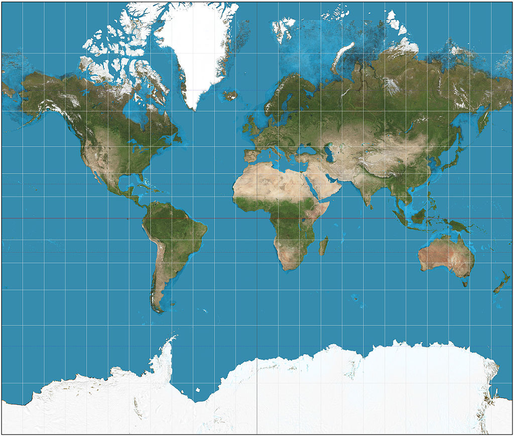
This is a map of the world you’re probably most familiar with.
The map, however, is a lie.
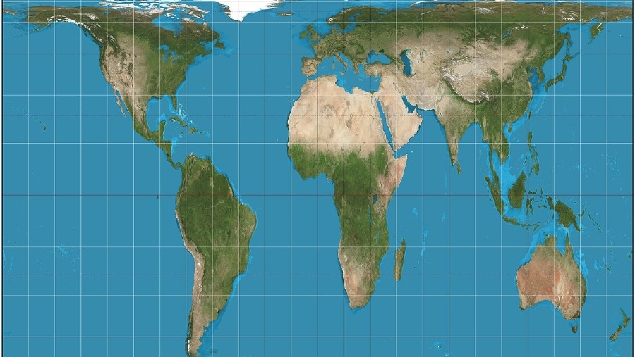
This is a more accurate depiction of the size of continents.
The Mercator system — the first map (ed. note: image changed from previous post) — distorts the size of the continents closer to the poles. It’s the product of trying to take a spherical map and make it a flat one. North America and Europe look bigger than they actually are in relation to the rest of the globe.
The Peters Projection map — the second map — is more accurate, so Boston public schools are tossing the old map and ushering in the new one in a bid to undo “500 years of distortion,” as The Guardian puts it.
Natacha Scott, director of history and social studies at Boston public schools, said it was “interesting to watch the students saying ‘Wow’ and ‘No, really? Look at Africa, it’s bigger’”.
“Some of their reactions were quite funny,” she added, “but it was also amazingly interesting to see them questioning what they thought they knew.”
Individual schools in the US have used the Peters maps, Scott said, adding: “We believe we are the first public school district in the US to do this.”
A school official said it’s the beginning of an effort to “decolonize” the public school curriculum.
As The Guardian points out, this was all once considered crazy talk, as evidenced by its inclusion in a West Wing episode in which the staff was required to listen to proposals from “crackpots.”
“The Mercator projection showed the spread and power of Christianity and is standard,” Jane Elliott, an Iowa-based lecturer in race relations, tellsThe Guardian. “But it is not the real world at all. What the Boston public schools are doing is extremely important and should be adopted across the whole of the US and beyond.”
She says it’s going to change how young people see the world.


