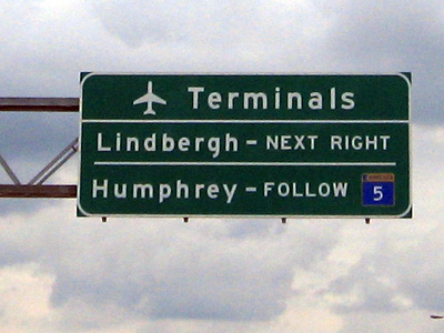
Few controversies — real or imagined — have died as quickly as the one over new airport signs on roadways leading to the Minneapolis St. Paul International Airport.
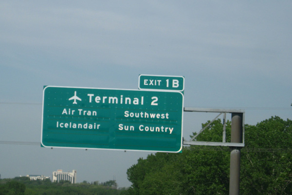
Critics jumped on a plan to replace the Humphrey and Lindbergh terminal signs with signs telling people which terminal — renamed Terminal 1 and Terminal 2 — hosted which airlines. But once the signs went up, the controversy ended.
Why? They made much more sense than the previous signs.
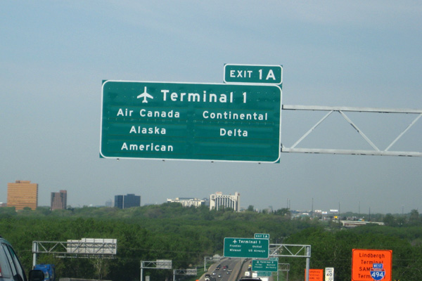
The only criticism we’ve heard is that if you miss the first sign, you might think the second one for Terminal 1 is the first sign, in which case you’d probably wonder where to go for your Delta flight. Ask me how I know.
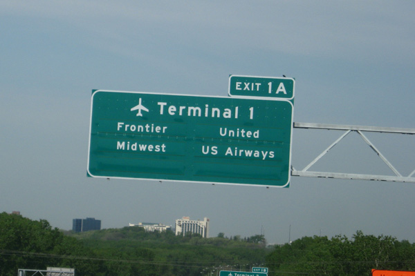
But a logical person would figure it out by the time the third sign came along (the one for Terminal 2, if you’re traveling westbound on I-494). If your airline isn’t listed there, it must be at Terminal 1.
Compare to the old sign…