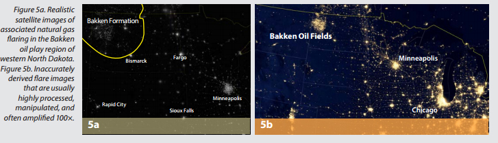
Perhaps you’ve seen these satellite images of North Dakota in which the Bakken Oil Patch is illuminated by all of the gas flares from the wells.
It’s a misleading photograph, University of North Dakota researchers claim this week.
A report from UND’s Energy and Environmental Research center says the the photographs have been enhanced (by the wide range of wavelengths) to make it appear the gas flares are the source of huge amounts of light.
Many published images tout new types of satellite imaging used to examine gas flares but seldom explain how the images are derived. These images are misleading in that they give the uninformed public the idea that flares are literally lighting up many square miles of prairie countryside, creating visible light similar to large metro areas.
So does the sky in western North Dakota really light up like a million-person metropolis? A casual drive on any evening through counties of the Bakken oil play shows otherwise. So how are these satellite images being formulated?
Researchers from the University of North Dakota (UND) Energy & Environmental Research Center and the John D. Odegard School of Aerospace Science’s Department of Earth System Science and Policy joined forces to get a better understanding of these bright satellite images.
The school’s researchers say they developed a more accurate method for processing the images.
To better characterize the Bakken oil play associated gas flares,UND researchers developed improved processing methods and a subpixel technique on data collected in nine spectral bands: one day–night band (DNB) and eight infrared bands of the NOAA VIIRS sensor.
Because a typical flare only occupies a 1/6000 fraction of a satellite pixel (800 m × 800 m), any contamination can easily skew the estimate of flares. To avoid possible contaminations, only VIIRS nighttime images that were cloud-free and only the middle portion of an image not affected by Earth curvature and geometric effects were used.
The daily VIIRS data collected were aggregated into monthly estimates and validated with ten specific active flares.
They came up with this before-and-after shot.
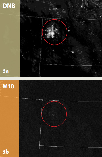
Figure 3b, in contrast, is the same area with a near-infrared spectral image showing faint, yet discernible, infrared heat signatures, more characteristic of what flares look like from space in the Bakken oil play region of western North Dakota.
For example, a highly sensitive camera taking separate pictures of a 75-watt incandescent bulb and a candle will show an incandescent bulb image that is saturated by light (all white), but the candle image will also show an “all white” saturation.