
The heavens above, in this case the Milky Way. So natural. So mysterious. So beautiful.
So incredibly fake.
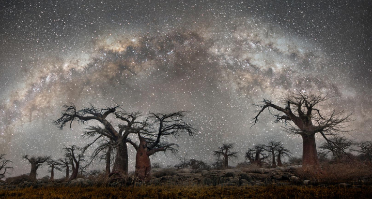
National Geographic pushed out this picture on its social networks in support of an article on photographer Beth Moon’s stunning photography.
It’s hard to sneak anything past people on social media. They have a habit of noticing things that don’t add up.
Specifically, they noted a pattern in the Milky Way, which is significant because the Milky Way doesn’t have patterns.
Catherine, how did you allow such fake images to be published by National Geographic? The astrophotography community is rather disappointed. Here's one example… pic.twitter.com/6rOx4Jet80
— Alyn Wallace (@alynwallace) May 7, 2019
Hello @NatGeo,
The last image in the article is fake.
The milky way in that image is unrealistic. It contains multiple copies of the milky way overlaid on each other (it happens when you use "content aware fill" in photoshop. pic.twitter.com/HBsHdkaCxl— B'lore Astro Society (@b_a_s) April 28, 2019
The controversy has been percolating for the last few days but today the photographer responded on PetaPixel.
She blamed the intern while accepting full responsibility.
I am late to this discussion as I am attending my father’s funeral.
First, I want to say that I am not much for technical expertise. For me, it’s not about the equipment. For these pictures I developed a fairly simple formula and memorized it, varying adjustments occasionally to suit the light. I also usually take my time producing work, but this work under starlight was the exception.
With three back to back trips and a book deadline I enlisted the help of an intern seven years ago. During her 6 month term she helped to batch process images and she also hand-stitched the panoramic shot in question. I got back in touch with her to ask her about this process.
She remembers stitching the images together one by one, lining up the tree branches by using the transformation tool to line each shot up. I believe the problem stemmed from the distortion of the wide angle lens used.
She claims she did not use the clone tool. To be clear, I am not passing the blame on to her. My name is on it and I take full responsibility.
This is a painful lesson. I am sorry to have upset so many people. I did not intentionally try to hide anything and I apologize. With the passing of my father I am reminded to try to concentrate on a bigger picture, which I hope to do going forward.
Of course, as long as we’re on the subject, let’s talk about pictures of space. They’re all “fake” to some degree if you believe that photography captures what the eye can see.
The eye can’t see any of this. It’s a trick accomplished though settings on the camera, just as the edited version is a trick accomplished by settings on a computer.
So, really, what’s the difference? It’s an artistic interpretation.
Those beautiful northern lights pictures you see? That’s not what the eye sees.
But a lot of people don’t realize that, which is how Iceland has developed a booming northern lights tourism industry.
They’re cool, for sure. They’re just not as cool as the pictures.
In the New Yorker last week, writer James Lasdun went to Iceland to see with the naked eye what he’s seen online.
Surprise! He didn’t find it.
We discussed why the aurora often looks so much better in photographs. He explained that a camera on a tripod, set for a five-second exposure, takes in far more light than the human eye does when it looks at something, and consequently it produces a more vivid image.
A camera can turn even relatively weak displays into dramatic pictures—and these images can then be subjected to digital enhancements. Posted online, the pictures are automatically sharpened by the high-contrast settings of most social-media platforms, and further boosted by the backlit screens of our devices.
Cumulatively, these improvements have encouraged unrealistic expectations. “It’s a shame,” (guide and photographer Kjetil Skogl) said. “You have a responsibility to show the truth.”
He has tried to open a discussion on the subject within the tourism industry, without success.
In a rare departure from diplomatic geniality, he dismissed most Instagram photos of the lights as junk —“digitally colorized files to produce likes.”
If the naked eye can’t see something, how can we ethically pass off digitally enhanced photographs as being an accurate of a representation of what’s in the sky or the degree of light it reflects?
(h/t: Paul Tosto)