Branding, you may have heard, is a big thing with the “let’s have a meeting” crowd. It fairly screams your product.
Does this scream Minnesota, Minnesota?

The Minnesota Department of Transportation was the first latest agency today to roll out the new official logo of Minnesota.
“The new brand will increase recognition, build trust (especially around cyber security), and change the story about what it means to work for and do business with the State of Minnesota,” MnDOT said on its website.
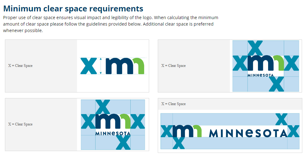
It’s not entirely clear to mere mortals how the logo builds trust around cyber security, but the design people have thought about this, including the proper spacing in its use. Nothing can lock down the state’s computer systems like proper spacing between other letters.
Why the new logo?
To support our diversity and inclusion efforts and goals around creating a 21st century workforce that reflects the diversity of all Minnesotans the state serves, the State of Minnesota is moving forward with a new, unified state brand across all state agencies.
Having one clear and consistent brand is an important part in the state’s future success as being a desirable employer and best serving the modern needs of our state’s citizens. A single, fresh brand will support our workforce efforts around recruiting, hiring, and keeping the very best talent.
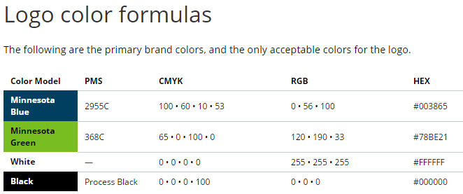
To highlight the diversity in the state’s workforce, Minnesota is using “Minnesota blue” and “Minnesota green.” And also “black” and “white.”
The old logo couldn’t handle the demands first placed upon it in the ’70s.
The old logo was meant to reflect “a rich, dynamic, multi-dimensional department and the transportation system we build and maintain.”
It featured MnDOT Blue. Employees were advised to “only use it in deliberate ways that elevate it to ‘special’ status”.
It did that with a star and half a pine tree.
You think you can do better?
(h/t: Cathy Wurzer)


